Logos & Brand Identity: Multi-Industry Conceptualization
A portfolio collection showcasing several logo marks and brand identities conceptualized, designed, and executed by me for various personal ventures and external clients, spanning CPG, Fashion, Tech, and Creative Services.
Design, Branding & Visual Strategy

Project Overview: Brand Identity Portfolio
Role: Lead Product Designer, Brand Identity Developer, and Vector Artist.
Scope: Conceptualization and end-to-end design execution of primary logo marks and visual systems for a diverse portfolio of brands, ranging from early-stage startups to established CPG and fashion ventures (Hungerd, Saraai). This work focuses on translating complex brand goals into simple, impactful, and scalable vector assets.
Process: Each project involved an in-depth exploration of the client's mission, target audience, and market landscape. The design process included:
Strategic Conceptualization: Defining the core visual metaphor (e.g., speed, hunger, insight).
Vector Fidelity: Ensuring the mark is technically perfect, scalable, and versatile for all applications (digital and print).
Outcome: A collection of distinctive and memorable brand marks that successfully capture the unique ethos of each brand.
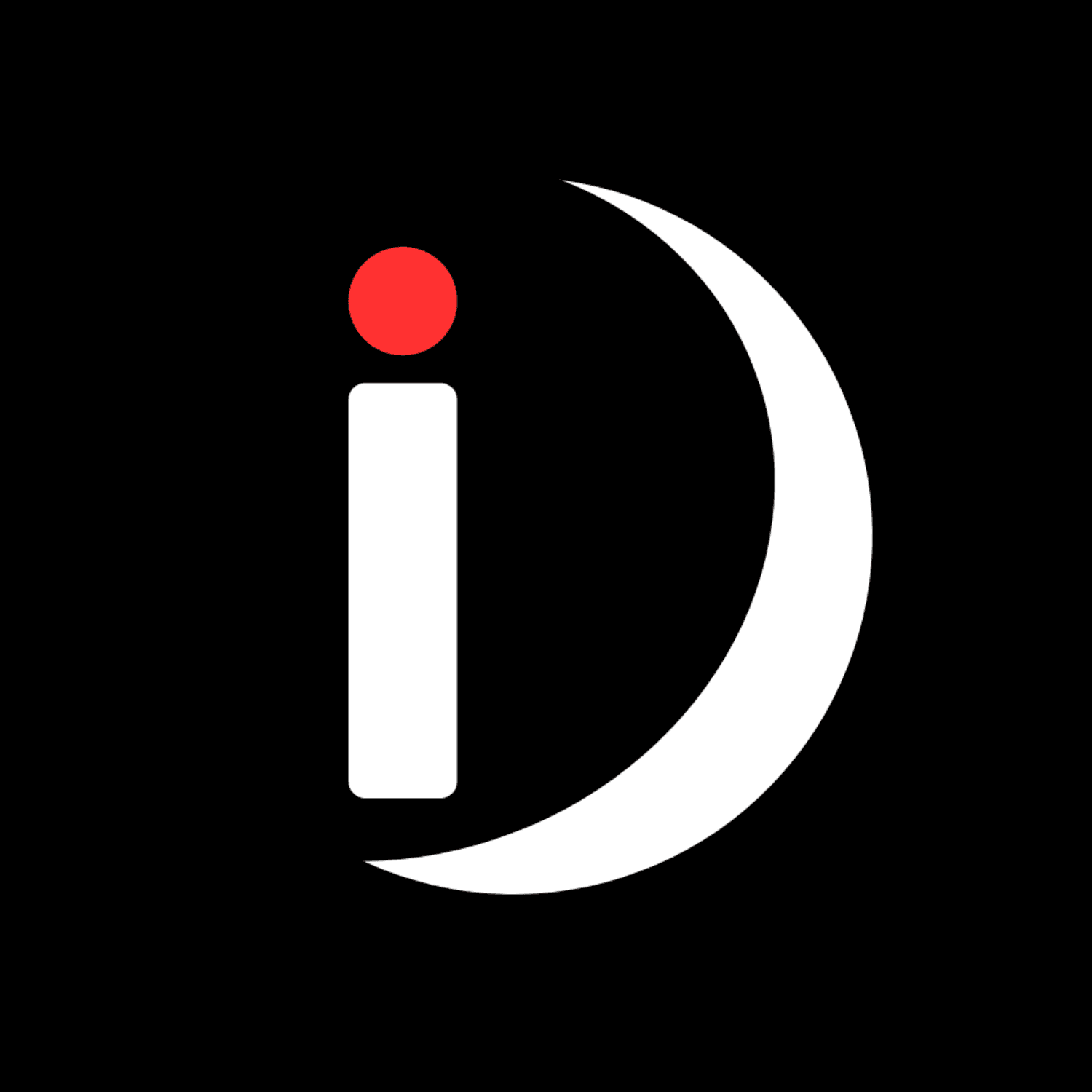
iDesigns - A creative agency
Concept: Idea Generation and Clarity
Focus - Communicate intellect and ideation through the stylized 'i' and its Red dot (the spark of insight).
Growth & Movement - The crescent shape suggests growth, cycles, and constant change—essential for a dynamic creative partner.
Aesthetics - High-contrast Black and White base for sophistication, accented by the vibrant Red focal point.
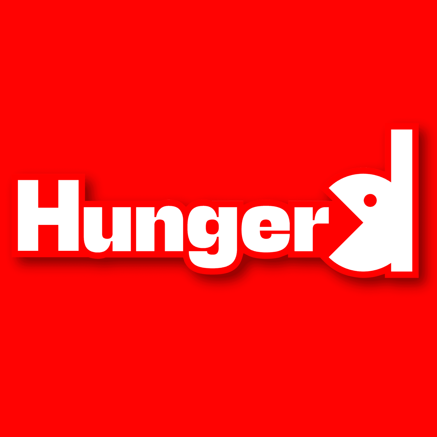
Hungerd (CPG Food Brand)
Concept: Playful Consumption & Eliminating Hunger
Visual Hook - Transforms the final 'D' into an abstract "Pac-Man" or eating character, symbolizing consumption.
Mission Alignment - The character is visually eating away at the word/space, symbolizing the act of eliminating hunger.
Aesthetics - Bold, heavy typography paired with a vibrant red background for maximum shelf visibility and urgency.
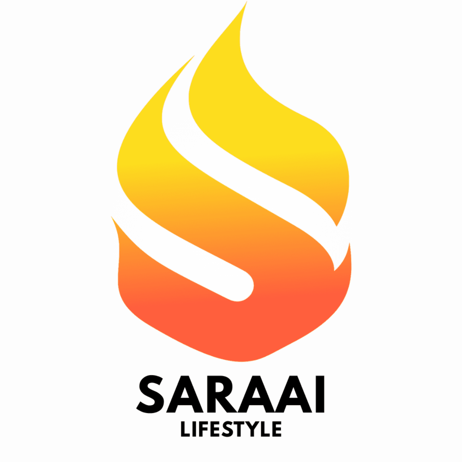
Saraai Lifestyle (Parent Fashion Brand)
Concept: Passionate Energy & Fluidity
Form - Uses a flame motif to convey passion, vitality, and life.
Branding Link - A subtle, curved 'S' is embedded within the negative space of the flame, linking the symbol to the brand name.
Aesthetics - A warm gradient (orange to yellow) reflects natural fire energy, creating an energetic and sophisticated lifestyle mark.

Vaporwear by Saraai (Athleisure Sub-Brand)
Concept: Motion, Speed, and Performance
Form - Highly angular shape forming a lightning bolt or upward arrow, communicating speed and athletic momentum.
Branding Tie-in - The stylized 'S' within the lightning bolt translates Saraai’s "fire energy" into a modern, electric "speed" motif.
Aesthetics - Monochromatic and sharp to ensure versatility across apparel, emphasizing technicality and performance.